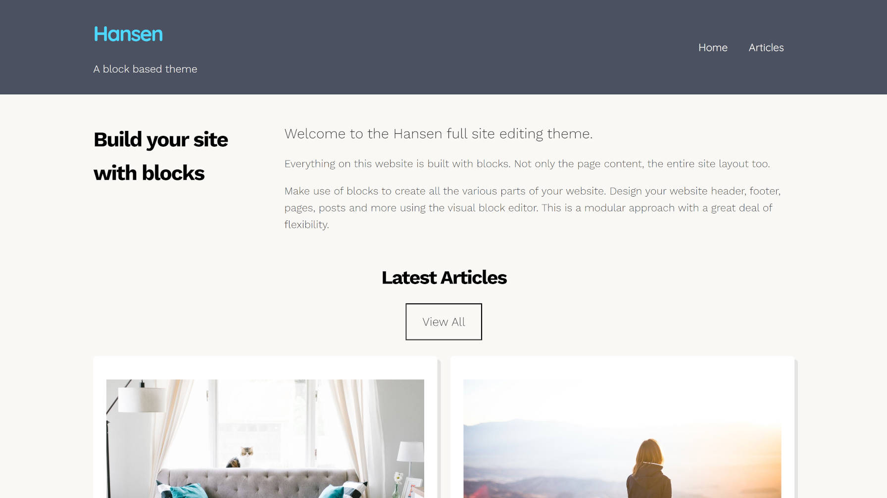
Earlier today, the WordPress theme directory welcomed its fourth block-based theme. Built by UXL Themes, Hansen is one of the more stylish projects capable of working with the site editor in the Gutenberg plugin. The theme author also stepped it up a notch and included several block patterns.
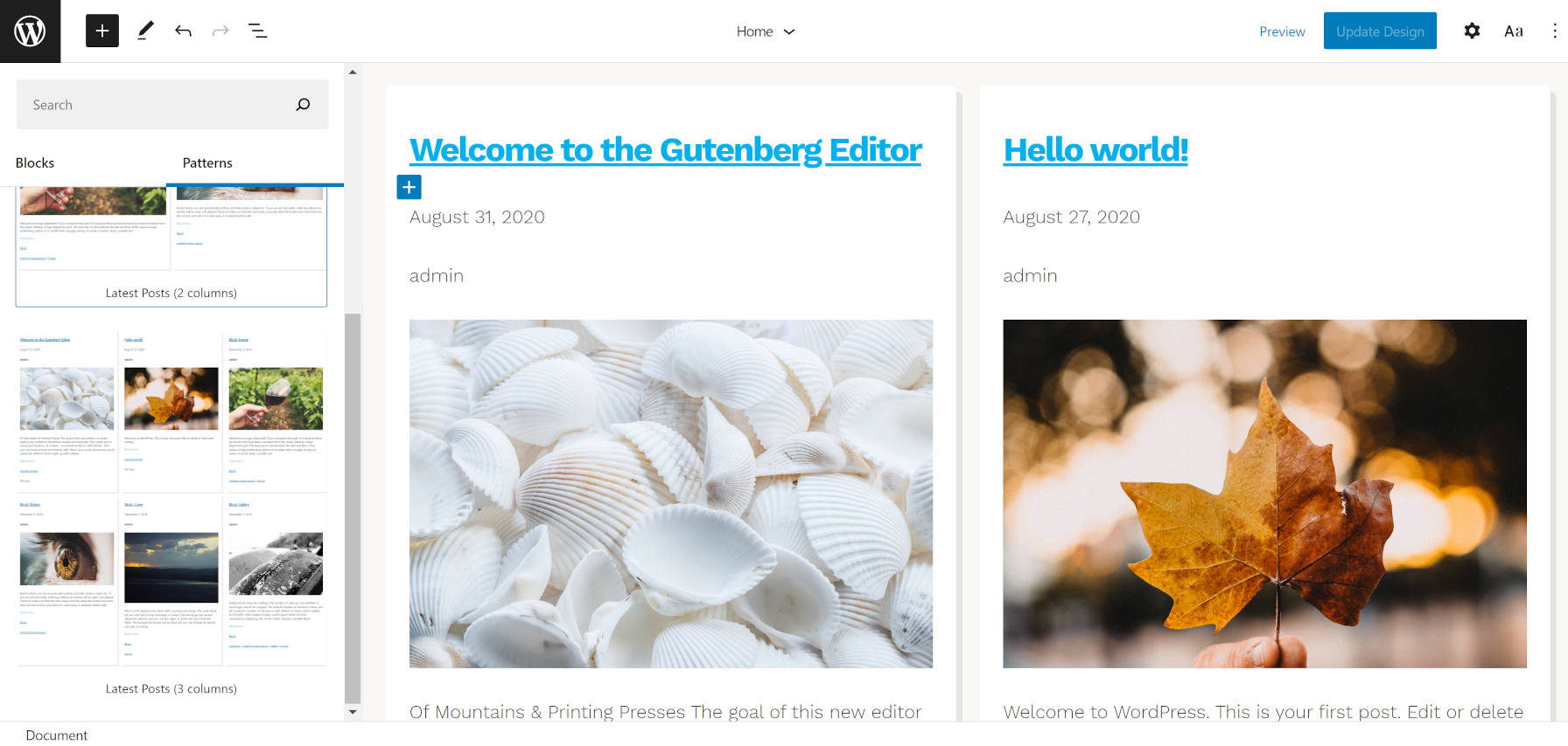
I have written about how patterns will be a game-changer. I have talked about the need for a UI overhaul to better expose them to users. And I have proposed that theme authors use the pattern system instead of templates, allowing users to build out full sections of their sites at the click of a button.
UXL Themes has done just that. Most patterns that we have seen thus far have been built primarily for post or page content. The Hansen theme takes that idea a step further and creates patterns for different site sections.
Want to try a different look for the header? Just remove the old one and swap in another header pattern.

How about changing the look of your blog posts page? The theme comes with two and three-column patterns for outputting the latest posts.
It also packages a Content and Sidebar pattern that is more suitable for single posts and pages.
I am still undecided on whether the patterns or template parts system is the ideal solution for this. Right now, patterns have a cleaner UI overall and can be categorized. Template parts might be easier to switch, but there is no way to group them (e.g., header templates, footer templates, etc.). Regardless of what becomes the de facto standard in the long term, we need more theme authors like UXL Themes experimenting with these concepts, seeing what works, and gathering user feedback.
The theme does not add much in the way of content patterns. However, it does include one named “2 Columns of Text and a Full-Width Cover.” While it is a bit of a mouthful, the name does fully describe what it does. This is also the pattern in use for the homepage in the theme’s demo. However, the demo has a slight modification, adding a custom latest posts section.

Hansen is more than just its patterns. The theme generally looks pretty good too. It has a bit more pizazz than we have seen from some other block-based experiments. Like the recently-released Phoenix theme, developers are becoming more comfortable moving beyond the bare-bones block-based designs from previous months.
These themes are obviously not on par with what one could build on more mature systems. However, Gutenberg’s FSE system is inching forward. The theme authors who are experimenting now are paving the way for the next generation of themes, which I am excited to see.
The Hansen theme also includes several block styles. Most are geared toward blocks that users would typically use in the site editor. I have not seen such an approach in previous block-based themes.
Two of the styles are for mobile navigation. The Mobile Friendly style displays a horizontal nav menu on desktop while switching to a hamburger-flydown on mobile devices. The Mobile Style alternative retains the mobile layout on all screen sizes.
There is a Box Shadow style for the Query Loop block, which adds a shadow to each post. In the future, I hope to see WordPress provide box-shadow options for this instead of themes relying on block styles. Nevertheless, it is a welcome addition for the moment.

The No Bottom Margin style allows users to remove bottom margin from Columns. I assume the theme author used this to address the common issue of nested blocks and their bottom margins adding on top of each other. I do not like this as a style because it gives the user the responsibility of fixing a design issue that should be taken care of under the hood. Generally, the problem stems from tackling spacing in design using a bottom margin instead of a top margin. It can be corrected in either case, but going with a top-margin approach is easier.
Outside of that one stylistic issue, the other downside to the theme is that it is not well-suited to long-form content out of the box. The content area stretches too wide for the default font size, making for uncomfortable reading. The theme includes a Narrow Width style for the Group block that corrects this. However, it would ideally be the reverse, with the content defaulting to a narrower width. Whenever a user wants to write a long-form blog post, they would need to wrap it in a Group block and apply the Narrow Width style. The more common use case should be the default.
Overall, I love the experimentation. Hansen is one of the best themes for playing around with the site editor in Gutenberg right now.